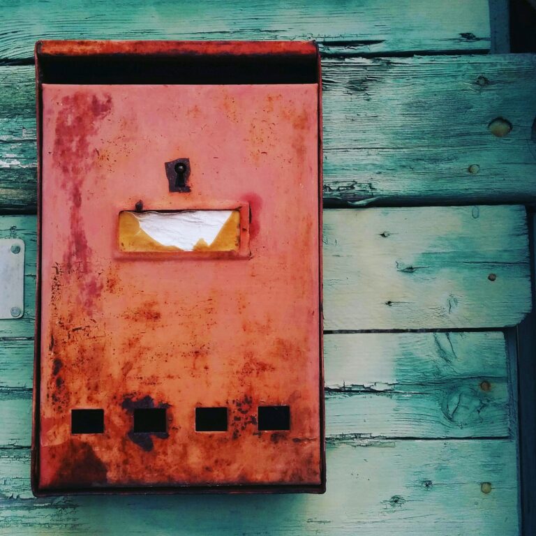
The Art of Mixing Patterns and Textures in Home Decor
Patterns and textures play a crucial role in the visual appeal of any space. They can add depth, interest, and personality to a room, creating a dynamic and engaging environment. When incorporating patterns into your design, consider the scale of the patterns in relation to the size of the room. Large patterns can make a space feel cozier, while smaller patterns can create a sense of movement and energy.
Textures, on the other hand, add tactility and visual interest to a room. Mixing textures such as smooth, rough, shiny, and matte can create a layered and multidimensional look. Consider incorporating different textures through textiles, furniture finishes, and decorative accents to add richness and warmth to your space. By understanding how patterns and textures work together, you can create a harmonious and visually intriguing design scheme.
Choosing Complementary Colors
When it comes to selecting complementary colors for your design projects, it’s important to consider the color wheel. Complementary colors are hues that are opposite each other on the color wheel, such as red and green, blue and orange, or yellow and purple. These pairs create a strong contrast and can make your designs visually striking.
Choosing complementary colors can add depth and visual interest to your work. By pairing colors that are opposite each other on the color wheel, you can create a dynamic and harmonious color scheme that is pleasing to the eye. Experimenting with different combinations of complementary colors can help you find the perfect balance for your design projects.
What are complementary colors?
Complementary colors are pairs of colors that are located directly across from each other on the color wheel. When used together, they create a high contrast and vibrant color combination.
Why is it important to choose complementary colors in design?
Choosing complementary colors in design can create visual interest, harmony, and balance in your space. The contrast between these colors can make your design more dynamic and appealing.
How do I find complementary colors for my design project?
To find complementary colors, simply identify the main color you want to use and then look directly across the color wheel to find its complementary color. This pair will work well together in your design.
Can I use different shades of complementary colors in my design?
Yes, using different shades of complementary colors can create a more nuanced and sophisticated color palette. Just make sure to maintain the balance between the two colors in your design.
What are some examples of complementary color combinations?
Some common complementary color combinations include red and green, blue and orange, and yellow and purple. Experiment with different pairings to see what works best for your design.


